Since February 2007, I’ve been on Twitter, almost entirely as a means of engaging with fellow librarians and others in affiliated fields. Now, I’ve deleted all of my tweets (more on that in a second) and just now, my account, too. There’s no need to go on here about why I left: it’s for the same reasons that everyone else had ever since Elon Musk took over the company. I would have done it sooner but for my worry about the best way to delete my tweets. I had read about paid services that some folks were using to have their tweets deleted in bulk, but I really didn’t want to have to shell out my own money for a problem some asshole billionaire created for me.
As an alternative that I heard about on this blog post at the Verge, I used the free version of Redact to do the job for me. It worked like a charm. And now, as of September 24, 2023, I am done with Xitter (FKA Twitter).
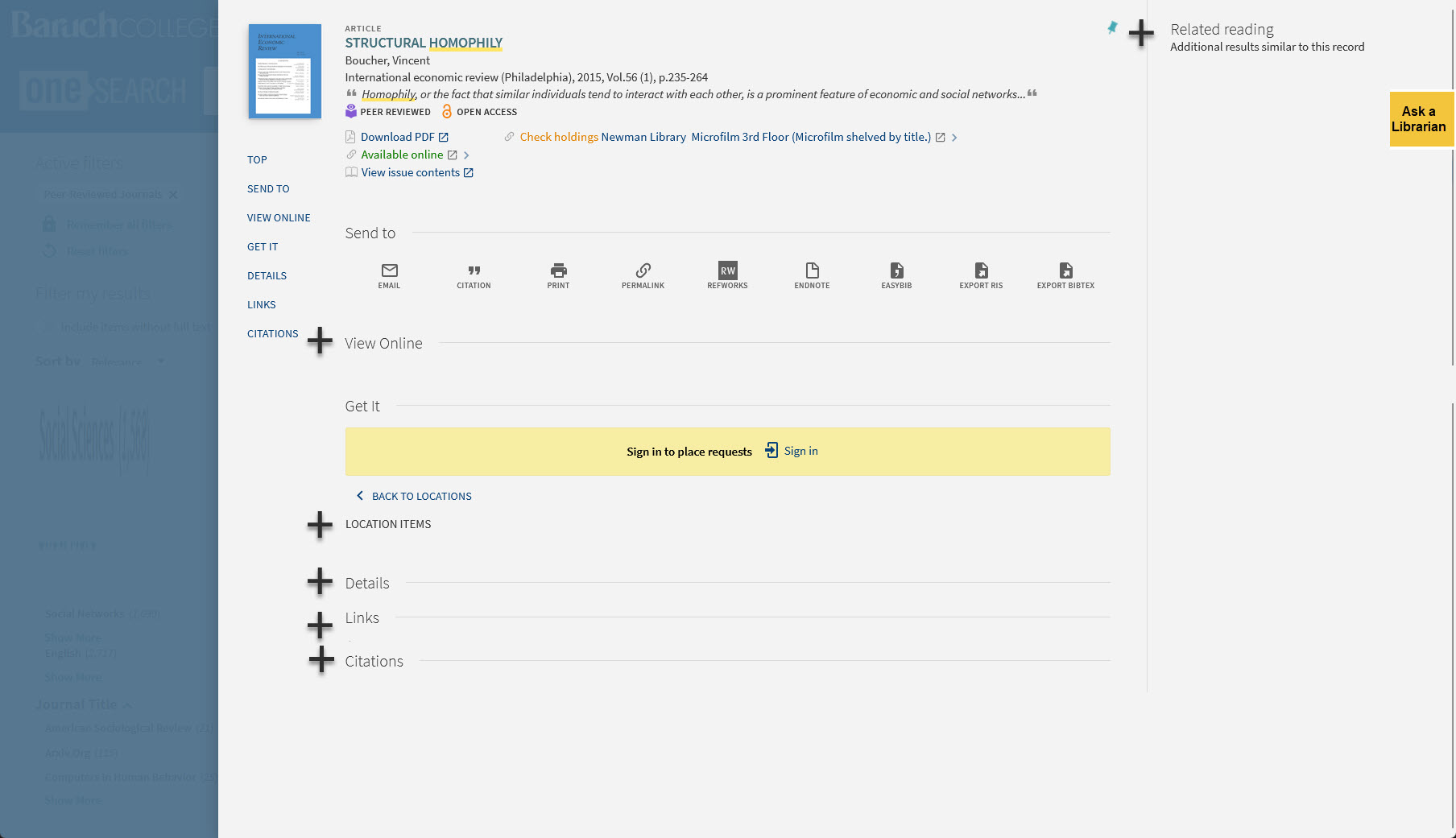
As I have been thinking this past week about the bX Recommender service that displays related reading options on journal articles, I have become more deeply convinced that the records in Primo VE present too much information on the screen for most users. In usability tests I’ve conducted over the years, students often comment on these pages as being too busy or confusing and they usually struggle to zero in on the relevant information for the particular task I’ve asked them to demonstrate. It is important to note that some records are longer than others for unavoidable reasons:
What I’m beginning to wonder is if some of the information in Primo VE records could be hidden behind an accordion element. If the user wishes to, they can click on an icon next to that section to expand it and see the hidden text. I haven’t seen any Primo VE instances that include accordion elements, which leads me to believe that there is no way presently to do that using the Ex Libris Primo interface. If you want to design your own discovery layer and bring the Primo VE results in via an API, that might work. But I would love to see a way to do that within the Primo VE interface as something that could be configured in Alma.
Here is roughly what I’m aiming at. Take this article record as an example. Below, I’ve added plus signs to show where you might have an expandable section in that record:
If you were to first encounter this record normally, you’d see all those sections collapsed like this:
Maybe this is too much information being hidden. But I think it is a direction worth exploring.
I’m still thinking through ways to understand the relative usage of the bX Recommender service in our instance of Primo VE (something I have already written about here and here). I’m not much of an expert in Alma analytics, but I am thinking that perhaps the basic dashboard we’ve set up there that counts clicks on most of the key features of the Primo VE interface might yield an interesting set of statistics that give some context to the usage data for bX Recommender (roughly 2000 clicks a year on recommended items). I am thinking that if I can understand whether the bX Recommender links are getting clicked more or less than all the other things one can click on in an item record for an article, that might be useful.
Probably the most comparable things in a record that a user can click on would be those elements that have a “more like this” or “more of this” functionality, such as clicks on:
author names in the “Creator” section
subject headings
the citation trail features (sources that cite the source I’m looking at and sources that were cited in the source I’m looking at)
the “next page” link on the search results pages
Then, I think it would also be useful to see how the 2000 bX Recommender clicks stack up against clicks on the links for some of more useful basic functions in an item record:
facet filtering
clicks on a database link or the “view online” link that takes you down to where the database links are shown
show the record permalink
email the record
get a citation for the record
export to various citation management services/file formats
results sorting options (by relevance, by date-new, by date-old
Not sure how much this will help but it should deepen my understanding of what users are clicking on (and, more usefully, not clicking on).
I took a day off from work yesterday to go to the Museum of Modern Art with my wife. We were eager to see the exhibit “Signals: How Video Transformed the World,” which is due to close on July 8. With one exception (Nam June Paik), I hadn’t heard of any of the artists or encountered their work before. What I was familiar with though where common themes that many of these video works addressed: the birth and expansion of the information society, the excitement of early ICTs as harbingers of a new global society, the broken promises of techno-utopians, the use of ICTs by surveillance states around the world, the creative embrace of ICTs by activists looking for ways to evade the gaze of authoritarian regimes, and so much more. These are issues that come up a lot in the courses I teach in my library’s information studies minor. My own understanding of these concerns comes primarily from reading (books, articles, blog posts, etc.), so it was especially exciting for me to encounter these ideas in works of art that used video in some way.
I don’t know how I got this far as a librarian without realizing until last week that there is a term for those paywalls that you see mostly on magazine and newspaper websites where you are allowed a set number of articles per month for free: a soft paywall. In reference interactions, I had been relying on using a laborious explanation to refer to that thing that the user was asking for assistance with (specifically, how they could get around the paywall to view the article that was so tantalizing close at hand). Now I’ve got a nice piece of jargon to use that may or may not need explaining to the user depending on the context.
Over the years, I’ve seen steady growth in reference questions where the user has found a paywalled article and wants to know if we can help them with it. The most common publications that generate this problem for us are the Atlantic, the Financial Times, the Economist, and the Wall Street Journal. Sometimes, I can just get the article for them and send it because we have in a database (even those tricky ones that aren’t in the regular periodical but are web-only articles). Sometimes, though, it’s web-only content that we don’t have access to in a database at all (the Atlantic is the worst for this). If I’m lucky, I haven’t hit the soft paywall yet on my own computer, and can get the article and send it to the user.
I’ve heard of librarians using the 12ft Ladder service to get around the paywall but haven’t used it in actual reference interaction yet. On their website, the folks behind it explain how it works this way:
The idea is pretty simple, news sites want Google to index their content so it shows up in search results. So they don’t show a paywall to the Google crawler. We benefit from this because the Google crawler will cache a copy of the site every time it crawls it.
All we do is show you that cached, unpaywalled version of the page.
Clicks on the Citation Trail feature (a related “you may also be interested in this” feature in journal article records)
The trouble with the search number data is that it doesn’t really get at the real question we want to answer: when users viewed the full record for a journal article that included “Related Reading” links from the bX Recommender, what percentage of those record views showed the user clicking on a recommended link? This question has an additional complication to it, as not all journal article records bring up the bX Recommender links. I’m not sure why the recommendations don’t always appear on every record. To get a rough idea of how often this occurs, I ran a search for “homophily,” limited the results to records from peer-reviewed journals, and then counted how many records in the first fifty had the bX Recommender links. I found that eighty percent did have the links (there’s that 80/20 ratio again!)
Even if we do happen to know the exact answer to that real question of recommender usage, I’m still not sure what to make of it. There are no benchmarks of bX Recommender usage that I know of. In an ideal world, I could ask Ex Libris to answer the question for me of how our numbers stack up against all the other Primo VE instances (you might have to come up with number that represents clicks per FTE and then perhaps also weight what percentage of each Primo VE’s discoverable content includes scholarly journal articles (it’s a community college library may have a notably smaller percentage of scholarly journals in their collections than a library at a large university).
Since getting the ideal usage statistics is probably out of the question, I’ve been thinking that maybe the numbers can be put in perspective with annual usage data of other services that have nothing or little to do with discovery interfaces but that give some overall sense of where the service fits into the larger set of services we provide. Being able to place the bX Recommender data into the context of all the “how many people did [fill in the blank]” in our library might be useful. I realize that looking at the numbers from various services leads to an inevitable “apples and oranges” objection, but I guess I’m feeing a bit stuck about how to come up with a solid way of analyzing usage of this service so that we can make a recommendation about whether to keep it or not.
One useful point of analysis that has been recommended to me is to consider to what extent this system supports the needs of our large undergraduate student population. Prioritizing spending that helps the college reach its stated goals of enabling student success makes sense to me, so maybe I’ll be thinking more about the extent to which the bX Recommender is a tool that students (especially the undergraduates) use.
Today’s design dilemma revolves around the question of whether an existing feature in an interface is getting used enough. Our Primo VE discovery layer (locally branded as OneSearch) includes an add-on service from Ex Libris called the bX Recommender. As you view records of journal articles in your search results, the service will serve up a short list of relevant articles on the right side of each record, as can be seen in the “Related Reading” section of this journal article record.
Ex Libris provides this quick overview of where the recommendations come from:
bX harvests link resolver usage data from many academic institutions around the world. If two articles are used in the same session, the system analyzes the connection between them and stores the items in a co-retrieval network. Because bX recommendations are based on link resolver usage, they are truly platform- and content-neutral. The usage is generated through discovery systems, A&I databases, publisher platforms, and any other source that links users to full text via a link resolver. The articles may be from different journals, publishers, and platforms.
While this content is seemingly useful, having it there comes at a cost to the user and to our library system. For the user, it adds a considerable amount of text to what is unarguably a very busy, text-heavy page design. For our library system, it is an add-on service to our Primo VE subscription that we pay extra for. A question has come up if it is worth having or not. We have usage data that suggests it is indeed getting used (roughly 2000 clicks a year) but it is not clear how much use is enough to merit the cost to the university for the subscription and the cost to the user for the added cognitive load. I don’t know how much we pay for this service, but if it is substantial, that’s a serious consideration.
My UX instincts tend to push me to be wary of the lure of features lest they then turn into featuritis situations, but without enough data about user behaviors and preferences in this matter, it’s hard to know how valuable this feature actually is and to what extent there is a notable number of users who like it. I wonder if the usage numbers are the work of a handful of heavy users of the feature or more evenly distributed; maybe it’s another example of the Pareto principle at work where only 20% of the users of the feature are responsible for 80% of the usage.
In theory, deciding what to do in this case is researchable. I can think of a number of different ways to get better data on usage of the service, perceptions of it, and the user experience of it. But, there are also dozens of other openly debated questions we have at our library and across our library system that need to be resolved, but only so much time and staff availability to make evidence-driven decisions. I guess we’ll have to figure out how much research we need to do on this matter to make a decision about whether to keep it or not.
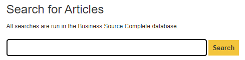
This week, the talented UX designer I work with has been working a small project as she uses up the remaining hours budgeted for her part-time position (our fiscal year ends in June). She’s been tweaking the various search boxes we’ve embedded in LibGuides pages so they have a more consistent look and feel that matches some of the design elements of the library website. For example, we needed to create a custom search box for our Harvard Business Review guide. Access to this periodical, which is highly popular at our business-centric college, is exclusively through EBSCO’s Business Source Complete database. Like many database vendors do, EBSCO offers a range of tools to build your own custom search boxes that will just search one or more of their databases.
Using EBSCO’s options, I created a search box that only searched in Business Search Complete and had hidden keywords that would get ANDed to every search: harvard business review and would make the results more precise for students who might type in just a few topic words or words from the title. The look of the search box from EBSCO left a bit to be desired, so we set to work adding some small elements to make it more noticeable on the LibGuide where it would be embedded: a thicker line around the text entry box and a search button that had the same shade of yellow we just elsewhere on our site:
This is not groundbreaking design at work. But it is the kind of thing that I think should be a core part of my efforts as a UX librarian: ongoing, incremental design changes. By using the same shade of yellow on the search buttons on our embedded search boxes, I’m hoping the users will learn to look for those buttons on our pages (even if they are not consciously aware of that effort) and come to think more generally that things in yellow on our site offer some action or functionality that is significant (for example, we use a yellow circle with a plus symbol in it as the icon for expanding an accordion element as well).
We’ve had this shade of yellow in the website for many years, but it’s only now that it occurred to me to begin using it more widely and with more intentionality. As much as I love the excitement of a splashy, big project (a complete overhaul of the site, launching a new service like our room reservation system, redesigning the main search box on the home page), these small ongoing changes to our site have an equally important role to play as we try to keep up with changing technology and evolving user expectations.
I don’t recall what book or article I read years ago on design or on the social aspects of technological change, but someone noted the design history of ships and how centuries of incremental improvements have been essential and mostly unheralded. Think of all the little experiments that sailors, shipbuilders, etc. have tried to make their ships better suited to the waters they sailed in or faster, safer, easier to handle, etc. That ceaseless tinkering is something I try to keep in mind so I don’t always focus on the grand projects but also the ones that over the long haul can make the site slightly better. As much as I can, I try to approach any designed element as imperfect, as something that can always be improved upon, even if only slightly.
I just finished reading Shelley Gullikson’s blog post from her plenary address a few weeks ago at the UXLibs conference and have some thoughts about my own experience as someone doing UX work in a library and who has a “UX librarian” job title. In her presentation, Gullikson discussed revisiting an earlier research project she did and wrote about in “Structuring and Supporting UX Work in Academic Libraries” that was published in Weave in 2020 where she reported on what she learned after interviewing thirty librarians about how UX work was done at their libraries. For her presentation, she re-interviewed a subset of those original study participants to drill down deeper in the role of collaboration in UX work. Summing up her findings, she notes:
I hoped my original project would point to some structures and supports that would help us be able to do great UX work. And although the themes that came through in that project bear out – essentially: don’t do the work by yourself, and have support from library management – upon reflection, they aren’t sufficient. And they aren’t necessarily things you can control. You can advocate to your management team, but you can’t make them give you direction or priorities or have expectations for you. You can try to encourage collaborative work with your colleagues, but you can’t make them be engaged, particularly if they’re overwhelmed with their own workloads.
Although structure is not sufficient for success, there can be structural impediments to success. Most of us will come up against those at some point. So, particularly after a conference where you’re hearing from so many fabulous people doing amazing things, please do remember that what works for someone else may not work in your context. With your people.
That contextual element being paramount sounds right to me, too. Or maybe that’s another way of saying that there are too many variables to definitively point to what the best kind of support and structure needs to be in place. The heterogeneity of our libraries (the people, the culture, the customs, the organizational structure, the tools and systems at hand, etc.) have got to be wickedly complicating any sort of analysis of what works. Having been in the position of UX librarian since 2011 here at Baruch College (and as the first and only person with that title), I can say that there has been enough churn in my world that I have a hard time explaining one why some projects worked or even got off the ground:
who I am working with in the library (including the part-time UX designer position I’m sometimes able to fill) and in campus IT (who have the development skills and server access that I don’t)
the CMS’s we’ve used
the search systems we’ve used (federated search system and ILS, Summon + ILS, Primo + Alma)
the new services that the library or the college decided needed to be launched that I’m expected to help set up (as opposed to my efforts to come up with my own agenda of what needs fixing, overhauling, etc.)
Complicating my sense of what works is that my title of UX librarian doesn’t fully describe all that I do. About half of my week is spent on e-resource management (which includes managing our EZproxy server). If you throw in reference duties (chat, email, desk), workshops for courses, liaison duties to three departments and to one program, committee work, and the credit course I teach for our library’s information studies minor every third semester. Those other responsibilities all have moments where they clamor more loudly for attention than one of the UX projects I’ve got on one of the burners (front or back).
Over the years, I’ve come to view my role here to be more than someone getting UX projects done. Instead, I see my role increasing as someone spreading the UX gospel much in the way our library made a concerted effort through careful hiring efforts in 2000-2010 to have information literacy be something that not only expanded our workshop and course programs (and moved away from the “bibliographic instruction” frame) but also informed and in some cases reformed our reference, collection management, and liaison work. So maybe for me, being successful is as much as helping as many parts of the library become as user-focused as possible and sharing ways that user research can enable those changes.
I’ve never participated in #blogjune before even though I’ve been blogging since 2003 (yeesh…just realized as I typed that that it’s been 20 years since I first started the Digital Reference blog on Blogger). In the blogging heyday (in the Aughts), I posted at most 2-3 times a week. The daily pace of #blogjune is a whole other level. In my posts on Digital Reference and Beating the Bounds (and the blog at work for reference services) I’ve always tried to focus on issues that relate to my work as a librarian. I’ve saved more personal topics for various social networks I’ve been on. This post will stray over to more meta/personal issues about blogging itself than I usually allow for here, but as I’ll explain, it’s all I have to write about today.
I’m finding that if I blog on a weekday, I’m pretty fired up about this or that issue that relates to something I’m dealing with at work. On the weekends, though, my mind has shifted to home life (planning chores that need to be done, thinking about chances to eat out or go to a museum, or, for the past gazillion weeks, strategizing about how I’m going to get my high school son to practice or a game or both for the travel soccer team he plays on). While I do think on Saturdays and Sundays about random issues or to-do items from work, my mind is pretty chill in that regards until maybe Sunday night. So today, a Saturday, I’m barely thinking about work projects, and that’s a good thing.
Another thing about trying to post every day for #blogjune is that I’m finding its exacerbating my lazy tendencies to not even want to proofread what I wrote. I just want to get something down and published. That’s not necessarily a bad thing for me, as I view the main thing driving me to blog is as an outlet for thinking through what’s rattling around in my head. The lesser but still important driver is my hope that there’s an audience generous enough to want to read what I’ve written and who may find something useful. With respect to the mode I’m in for #blogjune, I’m probably publishing more underbaked posts, but then on the other hand, I’m working through more thoughts that I would be if I were on my usual schedule (which over the past 4-5 years can barely be called a schedule given how much time elapses between posts).
The main reason why I decided to give #blogjune a go this time is because it started just as I was reckoning with how little I’ve published or presented in recent years. Posting on this crazy daily schedule (more or less) is giving me a chance to get back in shape as a writer after too many years of my inconsequential and unsubstantial tweeting, tooting, and commenting.