
As I have been thinking this past week about the bX Recommender service that displays related reading options on journal articles, I have become more deeply convinced that the records in Primo VE present too much information on the screen for most users. In usability tests I’ve conducted over the years, students often comment on these pages as being too busy or confusing and they usually struggle to zero in on the relevant information for the particular task I’ve asked them to demonstrate. It is important to note that some records are longer than others for unavoidable reasons:
- a journal article that has a dozen or more authors, all of whose names are shown
- a book where we have the table of contents displayed and the chapter titles and section titles are all lengthy
- an online resource that we have access to in multiple databases AND have print AND microfilm holdings that need to be detailed
What I’m beginning to wonder is if some of the information in Primo VE records could be hidden behind an accordion element. If the user wishes to, they can click on an icon next to that section to expand it and see the hidden text. I haven’t seen any Primo VE instances that include accordion elements, which leads me to believe that there is no way presently to do that using the Ex Libris Primo interface. If you want to design your own discovery layer and bring the Primo VE results in via an API, that might work. But I would love to see a way to do that within the Primo VE interface as something that could be configured in Alma.
Here is roughly what I’m aiming at. Take this article record as an example. Below, I’ve added plus signs to show where you might have an expandable section in that record:

If you were to first encounter this record normally, you’d see all those sections collapsed like this:
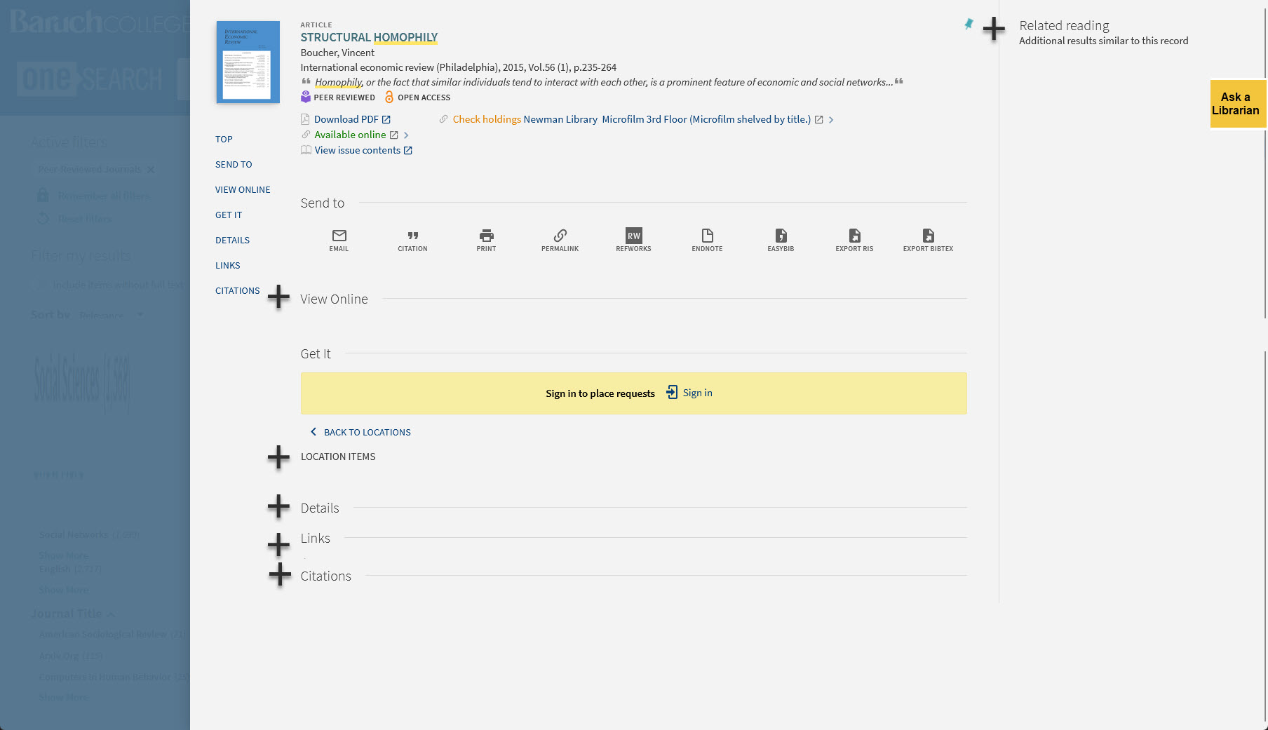
Maybe this is too much information being hidden. But I think it is a direction worth exploring.