This week, the talented UX designer I work with has been working a small project as she uses up the remaining hours budgeted for her part-time position (our fiscal year ends in June). She’s been tweaking the various search boxes we’ve embedded in LibGuides pages so they have a more consistent look and feel that matches some of the design elements of the library website. For example, we needed to create a custom search box for our Harvard Business Review guide. Access to this periodical, which is highly popular at our business-centric college, is exclusively through EBSCO’s Business Source Complete database. Like many database vendors do, EBSCO offers a range of tools to build your own custom search boxes that will just search one or more of their databases.
Using EBSCO’s options, I created a search box that only searched in Business Search Complete and had hidden keywords that would get ANDed to every search: harvard business review and would make the results more precise for students who might type in just a few topic words or words from the title. The look of the search box from EBSCO left a bit to be desired, so we set to work adding some small elements to make it more noticeable on the LibGuide where it would be embedded: a thicker line around the text entry box and a search button that had the same shade of yellow we just elsewhere on our site:
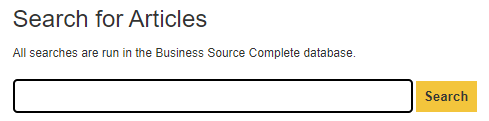
This is not groundbreaking design at work. But it is the kind of thing that I think should be a core part of my efforts as a UX librarian: ongoing, incremental design changes. By using the same shade of yellow on the search buttons on our embedded search boxes, I’m hoping the users will learn to look for those buttons on our pages (even if they are not consciously aware of that effort) and come to think more generally that things in yellow on our site offer some action or functionality that is significant (for example, we use a yellow circle with a plus symbol in it as the icon for expanding an accordion element as well).
We’ve had this shade of yellow in the website for many years, but it’s only now that it occurred to me to begin using it more widely and with more intentionality. As much as I love the excitement of a splashy, big project (a complete overhaul of the site, launching a new service like our room reservation system, redesigning the main search box on the home page), these small ongoing changes to our site have an equally important role to play as we try to keep up with changing technology and evolving user expectations.
I don’t recall what book or article I read years ago on design or on the social aspects of technological change, but someone noted the design history of ships and how centuries of incremental improvements have been essential and mostly unheralded. Think of all the little experiments that sailors, shipbuilders, etc. have tried to make their ships better suited to the waters they sailed in or faster, safer, easier to handle, etc. That ceaseless tinkering is something I try to keep in mind so I don’t always focus on the grand projects but also the ones that over the long haul can make the site slightly better. As much as I can, I try to approach any designed element as imperfect, as something that can always be improved upon, even if only slightly.